We’ve been around long enough to understand that creating a new product – will it be in Food & Beverages, Health or Wellness, there are NO shortcuts for pushing the packaging design across the FDA finish line.
We have worked through hell and back to get some key fail-proof guidelines that will cut-down the design and review time by so much! The FDA is constantly changing their guidelines, so to be perfectly honest, there is no way the designs will be approved on the first pass. There will always be some adjustments. FDA scans through everything up to spacing, lettering, copywriting and colors.
For instance: the FDA requires that packagers follow certain rules with regard to the information panel. As you design your food pouch, bear the following in mind: Use a print or type size that is noticeable, readable, and prominent. According to the FDA, letters must not be more than three times as tall as they are wide and must have a minimum height of one sixteenth (1/16) inch based on the lowercase letter “o.” Smaller type sizes may be used for information panel labeling on very small food packages if there is a space constraint. The Nutrition Facts label is required to use specific type sizes. For instance, the “Nutrition Facts” heading needs to have a larger type than everything else.
FDA-Compliant Label Basics
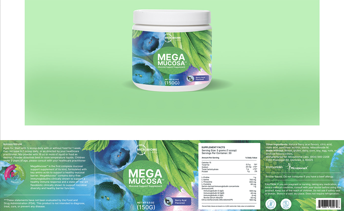
The front label panel and the information panel each have two labels for supplements. The side of a supplement box or bottle that faces the front is called the front panel. The name of the product, the manufacturer’s brand, and the net amount of the package’s contents are frequently found here. The information panel is located directly to the right of this label. Serving size, nutritional information, and an ingredient list are all contained in the information panel. Generally speaking, any nutritional supplement packaging must have the five components listed below in order to be FDA compliant.
- Statement of Identity — This is the official name of the supplement. You’ll usually find the statement of identity in the center on the front label panel. The official title of the supplement is Statement of Identity. The statement of identity is typically located in the center of the front label panel.
- Statement of Net Quantity of Contents: Customers are informed of the exact amount of product in the container. This information is typically located on the front panel, just south of the statement of identity.
- Nutrition Labeling — This section houses most of the detailed information on the supplement label. It’s commonly known as the Supplements Facts section. Daily values are listed here for all of the ingredients for which the FDA requires disclosure.
- Ingredient List – This is a comprehensive list of all the ingredients used to make the supplement
- Name and Business Address of the Manufacturer, Packer, or Distributor — You must specify the name, town, county, and state as well as the zip code of the business or businesses that produced, packaged, and distributed the dietary supplement.
Ideas for Supplement Label Design
Seconds count when trying to capture a customer’s attention. Consumers make online shopping decisions on average in 19 seconds, according to a report from the Ehrenberg-Bass Institute of Marketing Science. Shopping in-store reduces that time to 13 seconds. The label of your dietary supplement is probably the first thing a prospective customer sees when they come into contact with it.
You have a limited amount of time to convince the customer that your product is worthwhile to add to their physical or online shopping cart. It takes both art and science to design supplement labels that are successful. Here are our top eight tips for developing dietary supplement labels that will make you stand out from the competition.
1. Keep It Simple
From the moment a consumer looks at their cell phone in the morning until they fall asleep in front of the television at night, they are inundated with marketing messages. Keeping your marketing straightforward will make it easier for consumers to understand. Reduce the amount of printed text and instead use clear, high-quality graphics to communicate your marketing message.
2. Plan Your Color Scheme Wisely
Make use of the psychological associations that various colors naturally evoke. Green is the most widely used color for product labeling in the dietary supplement industry. The majority of consumers associate this color with growth and healthy living in their minds. However, you also want to ensure that your product stands out, so you might want to think about using a different color or a novel interpretation of the hue. You can also coordinate the color with the function of your product. For instance, red typically denotes strength and power, making it a good choice for supplements used during exercise.
3. Make Use of White Space's Power
Consumers will more easily understand your message if you strategically use white space on a product label to make your text stand out. Contrary to popular belief, white space highlights a design.
4. Create Memorable Text Designs
Use a thoughtful combination of fonts and type sizes to effectively communicate important information to the reader. Nevertheless, avoid using too many different fonts or type sizes.
5. Make Use of Top-Notch Materials
High-quality printing and materials are used to create labels that exude quality. Don’t cut corners on the label when marketing a new dietary supplement. Customers may think the product is subpar if the labeling appears cheap.
6. Maintain Consistency in Your Product Design
If you already sell other dietary supplements, consistency is even more crucial. To make it simple for customers who have enjoyed your other products to relate to your new line, make sure your label designs adhere to a common theme. Keep your product label design consistent with your brand’s logo and color scheme if this is your first offering.
7. Consider marketing that puts the planet first and is eco-friendly.
Consumers can tell you care about the environment if you use recycled fibers or a biodegradable plastic substitute when making product labels.
8. Hire professionals for graphics
Beauty naturally attracts people. A graphic that is skillfully created and strategically placed will aid in drawing attention and conveying your message. Make use of a graphic designer.
Adhering to FDA Regulations + Sound Strategy:
Supplement Labels A label for supplements that has received FDA approval can shield your company from regulatory inspection and lower customer complaints. Regulator compliance is important, but it’s not the only aspect of label design to take into account. You can increase the likelihood that people will choose to buy your dietary supplement over rivals by incorporating design best practices.
You might also like: